Becoming a new American Airlines

In isolation, American Airlines’ previous visual identity, designed by Massimo Vignelli in 1967, was a beautiful tribute to modern American design. The simplicity of Helvetica, set in red, white, and blue, and positioned next to an iconic eagle, defined the company with a subtle homage to the country it represents. It is too bad that such a great, enduring identity was placed into such careless hands. And now it is gone.
The design problems at American Airlines have never stemmed from its visual identity, but rather from its execution of that identity and from its culture around customer experience. But the bankrupt company, in a misguided attempt to change its external perception, set out to remake itself visually. Here is the new American Airlines:
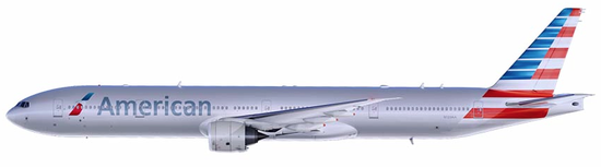

After forty-six years, one of the finest corporate brands in history has been reduced to patriotic lipstick.